Correlation vs Causation: the Truth About Lines of Best Fit
Q1: Can a scatter plot with a low R-squared value still provide meaningful insight?
A1: Yes. In domains characterized by high inherent variance, such as behavioral economics or public health, an r-squared value between 0.10 and 0.25 can uncover valuable structural effects. If the sample size is sufficiently large, a modest slope and y-intercept can isolate a genuine factor operating alongside countless uncontrolled environmental variables. Low variance explained does not imply zero practical utility.
Q2: Why does an outlier distort a linear regression line more than a median line?
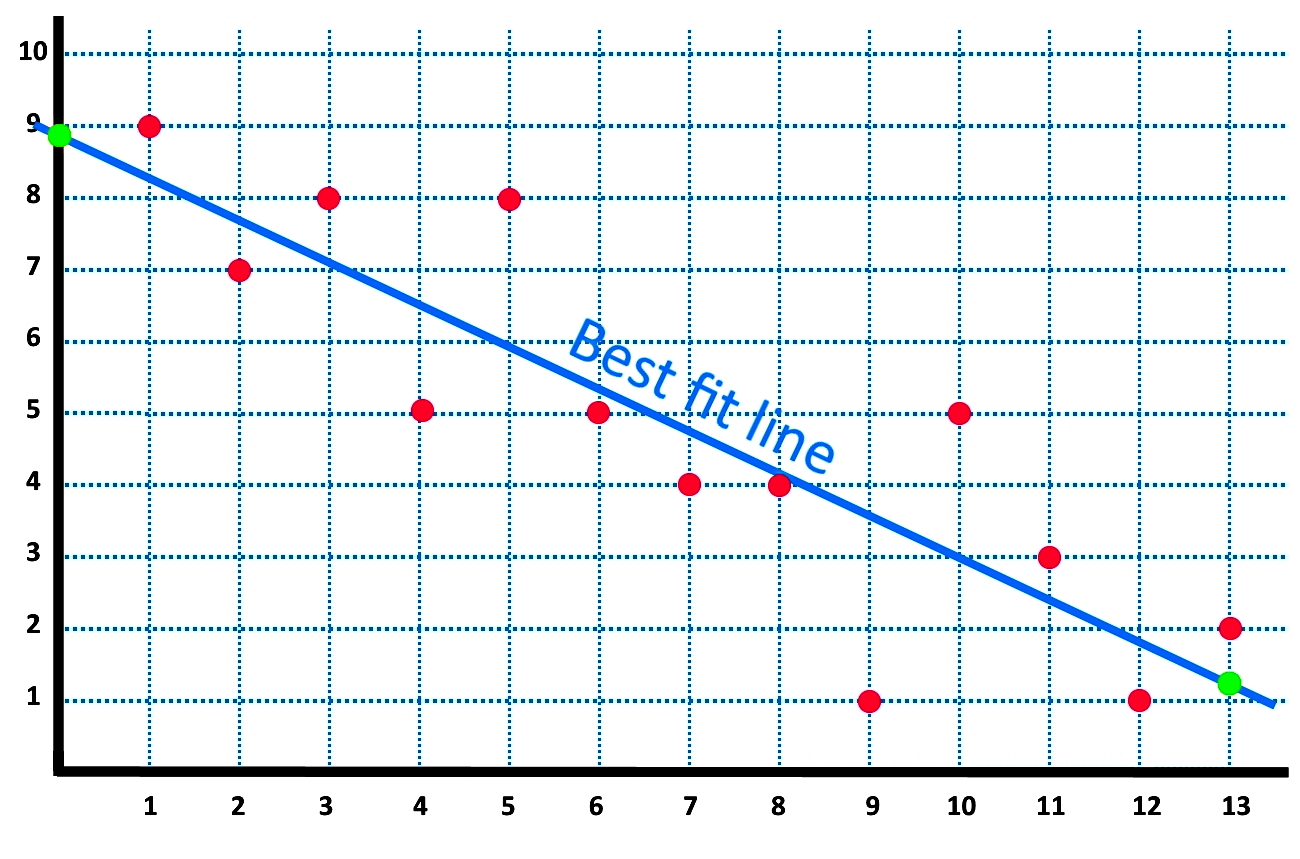
A2: The ordinary least squares method squares each vertical distance when calculating the line of best fit. Because deviations are squared, a single coordinate positioned far from the general cluster generates an outsized mathematical penalty. The algorithm shifts its slope and intercept dramatically to minimize that single squared error, pulling the trajectory away from the genuine center of mass.
Q3: What distinguishes a Pearson correlation from the slope of the trendline equation?
A3: The Pearson correlation coefficient reflects the tightness and direction of a linear relationship on a scale from -1.0 to +1.0, unaffected by the units of measurement. In contrast, the slope represents the physical rate of change, expressing the specific numeric movement in variable $Y$ per single-unit change in variable $X$. A relationship can exhibit a steep slope with poor correlation, or a gentle slope with near-perfect correlation.