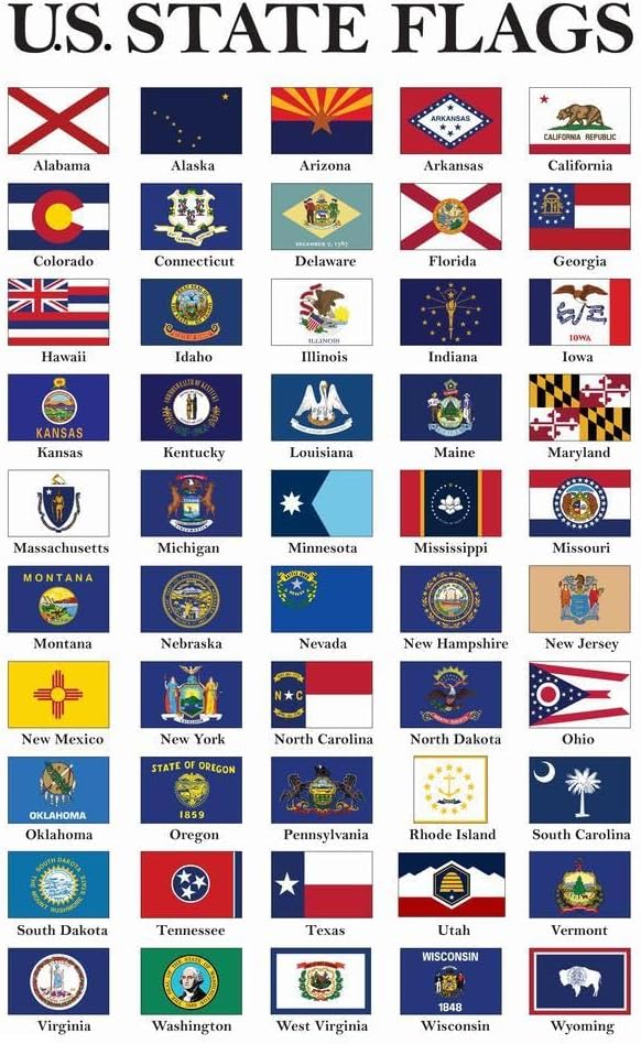
The Complete Guide to U. S. State Flags: Redesigns, Symbolism, and Pending Changes
Vexillologists have long held a derisive nickname for the default American state banner: the "seal on a bedsheet." Nearly half of all U.S. state flags historically originated by stamping a state seal or coat of arms directly onto an azure blue field. Most arrived between the 1890s and the 1920s, originally commissioned as military regimental colors or rushed into production for world's fairs. The result was visual chaos. From fifty paces away, Kansas, Montana, Nebraska, and New York were nearly impossible to tell apart.
The North American Vexillological Association identified the flaws in its foundational design guide, Good Flag, Bad Flag. The rules were straightforward: keep it simple, use meaningful symbolism, stick to two or three basic colors, include no lettering or seals, and be distinctive. A flag serves a mechanical purpose. It must signal identity while flapping on a pole hundreds of feet in the air or draped limply in dead calm.
Complicated state seals fail that mechanical test. State mottos like Virginia's "Sic Semper Tyrannis" or Idaho's intricate imagery of miners and cornucopias work on a parchment document. Reduced to cloth, their fine lines blur into gray smudges. When Roman Mars critiqued municipal and state emblems during his widely viewed 2015 TED talk, he introduced these vexillological critiques to millions outside the specialty. The public realized what flag scholars had documented for half a century: most state flags failed at basic visual communication.